
Web Design: How Not to Design A Web Page
I would like to offer some advice to you on web page design. In fact I will show that even professional page designers can mess page design up in a big way. The inspiration for this article was an entirely disagreeable experience I had. I was googling for information about the Java Data Mining API. One article looked promising so I clicked and was left aghast at what I saw. I am not going to name the site but it is a commercial web site. In fact I even used to subscribe to one of their magazines.
In order to clarify their web page layout, I have created a color coded block version of the web page where the colors identify the different functional areas. These areas are defined based on the nature of their purpose. The key to the color blocks is:
- White
- The white space that every web page must have in order to improve readability.
- Green
- This is the Content area. It is the reason you are actually reading the page
- Blue
- This is the area devoted to site navigation and links to other areas or content on the web site. It is supposed to be there to help your visitor navigate your web site.
- Black
- These are areas of site overhead. This includes things like the logo, banner, self-promotions, etc.
- Red
- These are the areas devoted to commercial advertisements. Yes, businesses do have to make money and commercials are a mainstay.
Good Web Page Design Rule 1: Be Sure that some content appears above the fold.
Remember the little old lady in those Wendy's commercials whose memorable line was "Where's the beef?" Well my question was "Where's the content?" With my browser fully maximized, I saw not one byte's worth of content in my browser window. At this point I didn't even know if this page was even about the Java Data Mining API. Figure 1 provides a block illustration of what I saw.
Figure 1. Block Illustration of the web page above the fold.
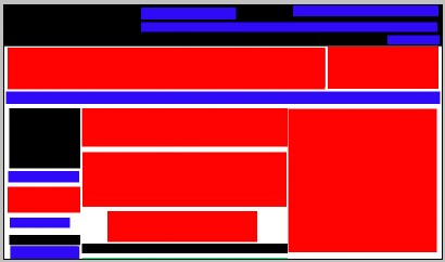
Note the lack of green. I had to page down before seeing the start of the content. You may have heard the term "above the fold". In newspaper parlance, this is what is visible to the reader above the fold in the middle of the newspaper. In web design, this is what is visible in the initial screen without scrolling. Respect your site visitors. Make sure that your content is front and center.
Good Web Page Design Rule 2: Maintain a reasonable ratio of content to total page area
Figure 2 is a block illustration of the full web page layout. I have divided the web page into areas based on the nature of the information they contain:
Figure 2. Block Illustration of the complete web page.
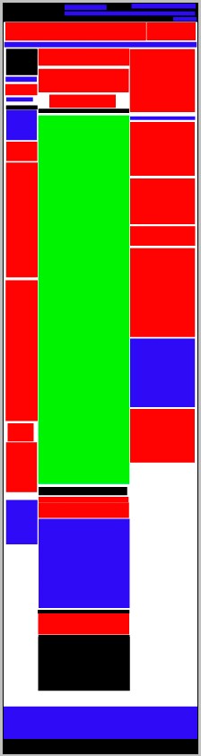
The total area consumed by this web page was 1007 wide by 3909 long, for just over 3.9 million square pixels. The area devoted to content was 474 x 1921 pixels or just over 900 thousand square pixels. As a percent of the total page area, content works out to a paltry 23 percent of the page. Commercials account for 32 percent of the page area,
My advice is to make sure that content consumes a larger percentage of the total page area than any other category. Look at it like this: how many people would watch a one hour long television program if the program itself was 14 minutes with 20 minutes of commercials? Granted, this is not an exact analogy but you get the point.
Good Web Page Design Rule 3: Keep your navigation together.
Take a look again at figure 2 and note how the blue areas (the link areas) are spread around the page. Why make your visitor search to figure out where links are? Keep it organized, keep it together - your visitors will appreciate it.
Good Web Page Design Rule 4: Don't Go Nuts With the Links
Every web page needs links. Links to help users navigate the site and links to related content that the visitor is likely to find useful. Using a food analogy, let us say that our web page is a fried egg. The links on the page are pepper and serve to spice things up. But pepper should be used sparingly.
Now take the page under review. I counted the links using a handy Firefox extension. There were 170 individual links on this page. It's a link swamp. They did not just sprinkle some pepper on the egg - they emptied out the entire bottle. And what's worse, in quite a number of instances links to advertisements are indistinguishable from links to content on the site! Good God Man - have some mercy on the folks who visit your site.
The Last Word
On my user friendly scale, I gave the web site in question zero stars. Note that I have not addressed the issue of the fractured content (links to content related images that were easily small enough to be embedded inline with the content itself).
Experience is a great teacher. When you visit a web site, take note of what is good and bad about the site's design from your perspective as a user. Then when designing your own site, bear these things in mind.
Return to the Web Design section index.
Copyright ©1999-2023, Astrodigital, http://www.astrodigital.org. All rights reserved. Direct questions, problems and update notification requests to Contact