Web Design: A Web Site Redesign
By Jim Plaxco
July 14, 2007. I just completed the redesign of the Chicago Society for Space Studies web site. The Chicago Society for Space Studies is a not for proft educational space activist organization for which I am a Director and Vice President. Being the web master who created the site, I was intimately familiar with the existing site's structure, visual design, and coding. This familiarity served to make the redesign process easier than it would have otherwise been.
My decision to redesign the site was driven primarily by cosmetics. The existing design, shown in Figure 1, was created as a consequence of the migration to the chicagospace.org domain. Because I had minimal time to devote to that migration, I spent a minimum of time on the redesign. That redesign consisted only of updating the docttype for all pages to the HTML 4.01 Transitional standard; validating all pages to insure compliance with the the HTML 4.01 Transitional standard; adding a CSS (Cascading Style Sheets) style sheet as the original pages were created in the days before CSS; and migrating much of the presentation-related parameters from embedded HTML to the CSS style sheet.
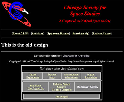
Figure 1: The CSSS web site to be redesigned
In looking at the old site, it's strong point is its simplicity. Simple text navigation, simple page layout, minimal overhead, no CSS, and Javascript only to encode e-mail addresses. This simplicity meant that if someone else had to take over ownership of the site, they would be able to do so with a minium of knowledge and about as small a learning curve as you can get. In my experience with small non-profits I have seen it happen more than once where an experienced web developer created a complex site for the organization only to then move on, leaving the non-profit in the awkward position of having a web site but not having anyone with sufficient experience to maintain or modify it.
The downside of the redesign that I had in mind was that the site would become slightly more complex: both visually in terms of the number of navigation elements per page, and support wise in terms of the amount of code necessary to implement the graphic design I had in mind. However, it is my belief that this slight increase in complexity is more than compensated for by the site's increased usability and professional appearance.
Identifying Problems and Shortcomings with the Existing Design
My first task in the redesign process was to analyze the current site design and create a list of shortcomings. Following an examination of the web site, I identified the following changes that I felt needed to be made:
- Functional - Add additional navigation sections and options
- Functional - Add site search capability
- Visual - Create a two column page layout
- Visual - Create visually responsive navigation bar buttons
- Visual - Create a more attractive banner image
- Visual - Replace the existing layout and color scheme
- Maintainability - Use CSS to control page layout and presentation
- Maintainability - Migrate from 4.01 Transitional to XHTML 1.0 Transitional
Let's take a look at each of these redesign changes in more detail.
1) Functional - Add additional navigation sections and options
The addition of new navigation elements was to satisfy two goals. The first was to support the addition of new content groups. The second was to support the addition of a site search tool and the addition of several informational links not a part of the site's primary navigation.
Because of the simplicity of the existing site and the initial design work done to make sure that the various pages were logically grouped into an appropriate organizational structure, there was no need to reorganize the site's information architecture. The old site was organized along the following primary navigation elements:
- About CSSS
- Activities
- Speakers Bureau
- Membership
- Explore Space
Having only five high level navigable sections, I felt safe adding new sections that would allow users to more quickly find the new content being added to the web site. The new site's navigation items are:
- About
- Join (replaces "Membership")
- News (new content section)
- Activities
- Speakers (replaces "Speakers Bureau")
- Articles (replaces "Explore Space")
- Links (new content section)
- Pictures (new content section)
- Contact (new)
Note that whereas the original navigation system sometimes used two words to identify a section (Speakers Bureau), the new system uses only one word (Speakers). This is a consequence of the redesigned nature of the links with CSS created buttons replacing simple text links. The change to one-word links was done to provide visual consistency to the buttons while minimizing ugly wrapping that could occur for those users who over-enlarge the text being displayed in their browser window.
In addition to the primary navigation, a secondary collection of links was added in the new right-hand column on each page (explained in the next section). These links are not part of the site's navigation but are meant to provide additional functionality and a means of highlighting important content. Examples of content being highlighted are the CSSS Speakers Bureau, the CSSS Yahoo Group Signup Form, and an advertisement for the 2008 Space Settlement Calendar, for which CSSS was a cosponsor.
Removed from the new design was the table of text links to associated sites that appeared at the bottom of each page. These links were moved to the site's new links page.
2) Functional - Add site search capability
The addition of a site search function was fairly straight forward. The first step was to create an account at Freefind.com and follow their instructions for creating the necessary form. It was then a simple matter to incorporate the form's code into the righthand column of the page design.
3) Visual - Create a two column page layout
Whereas the original site used a single, screen-wide column layout, I wanted to add a second narrow column to the right hand side of each page for the new design. The purpose of this column would be to support secondary navigation elements as well as organization-related advertisements.
4) Visual - Create visually responsive navigation bar buttons
With the old site, the primary navigation was a horizontal navigation bar under the banner image that consisted of simple text links. These links provided no visual feedback to the user. For the new site, I wanted to achieve a simple button effect when the user moved the cursor over the link area. To keep the underlying implementation as simple as possible no graphic files were used. The necessary effect was achieved entirely in CSS. One consequence of this change was a simplification of the wording associated with each link. All two-word link names were reduced to one word to provide visual consisteny between the individual links.
5) Visual - Create a more attractive banner image
The banner for the old site consisted of the name of the organization and the organization's logo. Simple but not very attractive. For the new design, I incorporated a night photograph of the Chicago skyline that I took from the Adler Planetarium. For those not familiar with Chicago, the Adler Planetarium sits at the end of an extension out into Lake Michigan making it one of the best land-based locations for taking photographs of the Chicago skyline. The picture is actually two separate photographs composited together to create a wide angle view.
Unfortunately the old CSSS logo did not fit in well visually with the Chicago skyline photo so I created a new version of the logo and replaced the solid red rocket trail with a blue-tinted, dot textured trail.
6) Visual - Replace the existing layout and color scheme
With the old site, the entire web screen showed up as black with red and blue text being used for headings and white text for content. There was no graphic component to the design. I wanted the new design to be graphic in nature with dark text on a light background.
I began the process by looking through the various free web page template sites looking for a simple graphic design. I did find one and downloaded it. I then used Adobe Photoshop to create my own version of the design and incorporated the new banner image in that design. Figure 2 shows a scaled down version of the graphic template I created in Photoshop.

Figure 2: The graphic template created using Adobe Photoshop
The next step was to take this graphic, slice it into individual elements and position those elements using CSS. As a starting point I was able to use the CSS code that came with the free template as it included the basic elements I was looking for: a banner image section, a horizontal navigation bar, a primary content area, and a second narrow column on the right. Quite a bit of tweaking was necessary as my graphic components were not the same size as those used by the template, and I wanted the column widths and margins proportioned differently. However, using this template as a starting point definitely reduced the amount of time needed to code the new design.
7) Maintainability - Use CSS to control page layout and presentation
For a graphic, multi-column web page layout, CSS is really the only implementation option to consider. Stay away from HTML tables. My decision to use CSS to control page layout, while making the site easier to maintain, will require that my successor/backup has a good understanding of Cascading Style Sheets.
8) Maintainability - Migrate from 4.01 Transitional to XHTML 1.0 Transitional
To insure smooth migrations to new designs, functionality, etc. in the future, and to maximize the longevity of this design, I decided that it was best to migrate from HTML to XHTML. To stick with HTML now would only make it harder to migrate in the future, assuming continued growth in the web site.
Implementing the New Web Site Design
While the creation of a new site design was a time consuming process, I found the work enjoyable so the time passed quickly. However, much more tedious, and probably the most time consuming part of the project was the actual migration to the new site design. The elements of this process included:
- replacing the existing design code with the new design code on all pages
- identifying HTML presentation parameters in the existing content and where easy, migrate those parameters to CSS
- modifying existing HTML presentation parameters in the existing content to color correct for the change from a black to white background
- using the W3C validation service to insure that all pages are XHTML 1.0 Transitional
Closing Remarks
A site redesign need not just be for appearance or organization. It should be looked upon as an opportunity to reevaluate all aspects of the web site's implementation. Page layout, color scheme, information architecture, system of navigation, and coding standards should all come under review. Done correctly, a site redesign should result in a more attractive, useable, and maintainable web site.
Figure 3 below is the "after" shot of one of the web pages. If you want to take a closer look, then just head over to the Chicago Society for Space Studies.
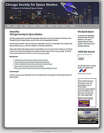
Figure 3: CSSS New Web Site Design
Return to the Web Design section index.
Copyright ©1999-2023, Astrodigital, http://www.astrodigital.org. All rights reserved. Direct questions, problems and update notification requests to Contact